
sticker of the month
OVERVIEW
In this year-long campaign, I designed a sticker for every month of the Fall 2025 and Spring 2026 semesters. Sticker of the Month celebrates holidays, brings awareness, and spreads positive messages by spotlighting a new theme every month.
concept
This school year’s design features a collage of different colors, papers, textures, and items that relate to each month’s theme and message. Every student’s college career becomes a collection of photos, experiences, and memories that shape who they will become. The collage theme represents this transition as each piece comes together to create a story.
Illustration
Product design
Motion design
DISCIPLINE
DELIVERABLES
8 sticker sheets
General Promotional Posters
Digital Screens (motion graphics)

general promotional posters
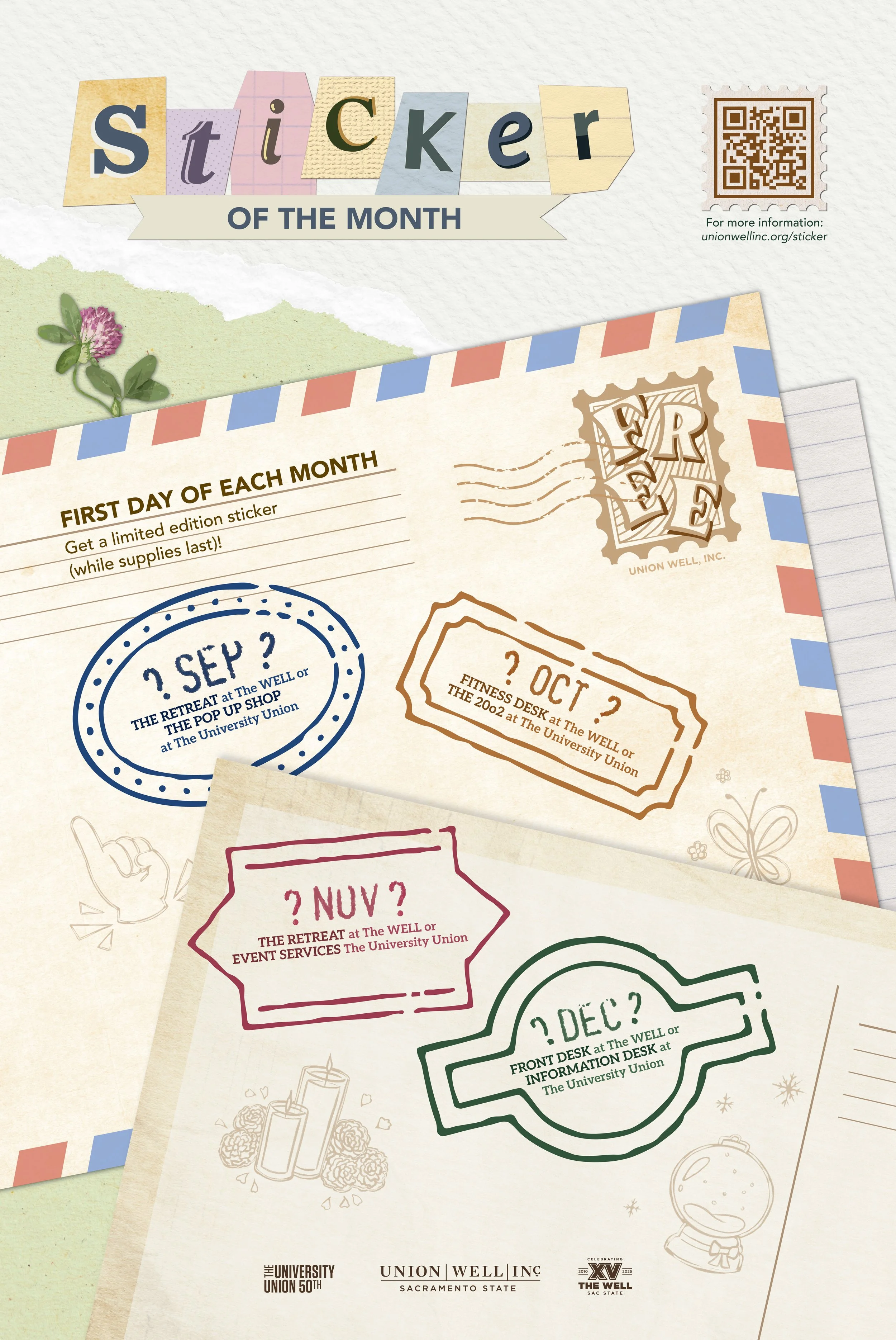
Each semester (Fall 2025 and Spring 2026) required a promotional poster that establishes this year’s design system while providing students a “sneak peak” of the upcoming stickers. Each stamp represents a month, with question marks to create a sense of mystery.
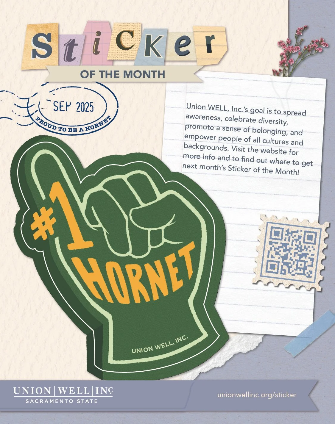
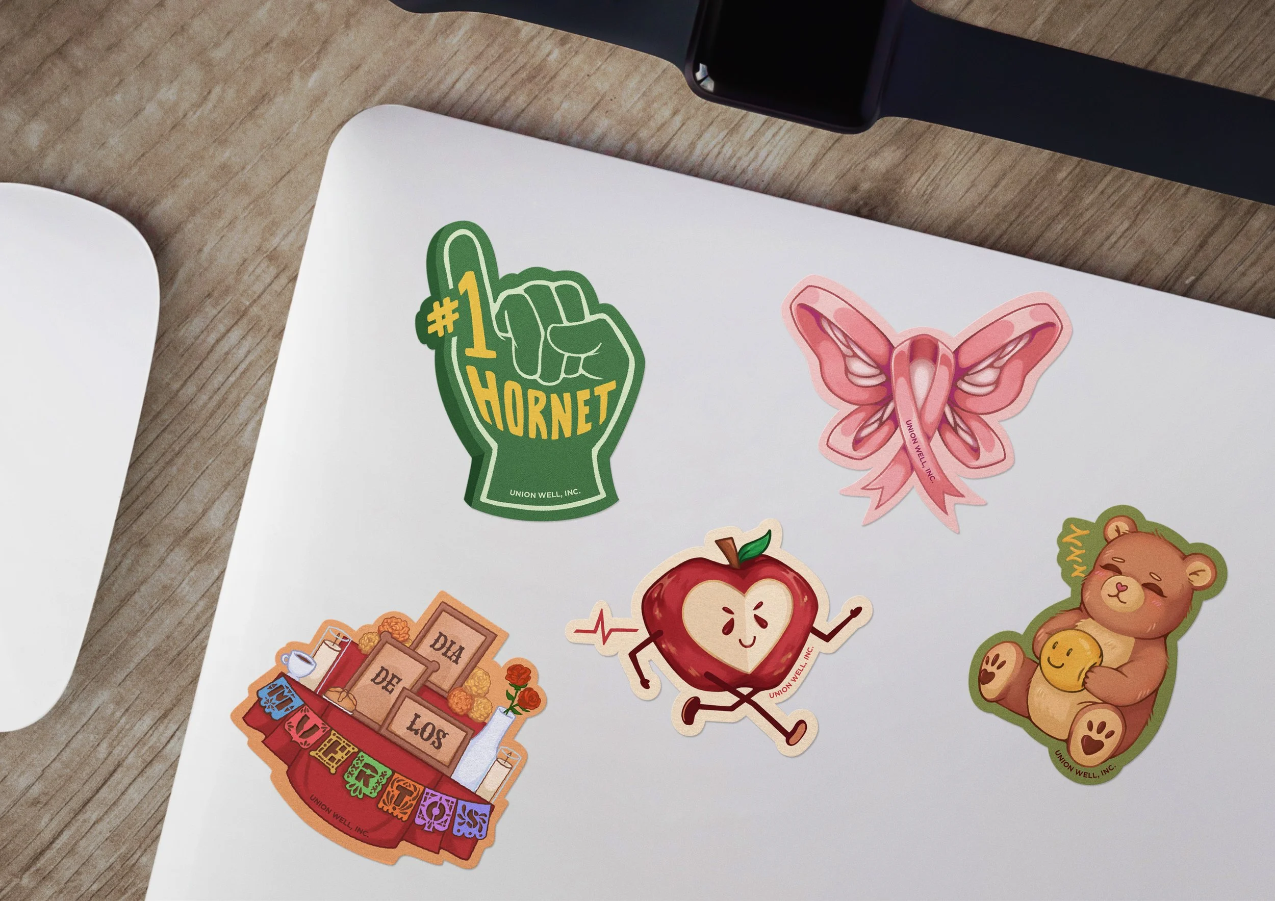
September’s sticker starts the school year off with school pride! The “#1 Hornet” foam finger represents students at Sac State cheering for themselves and other students.
PROUD TO BE A HORNET
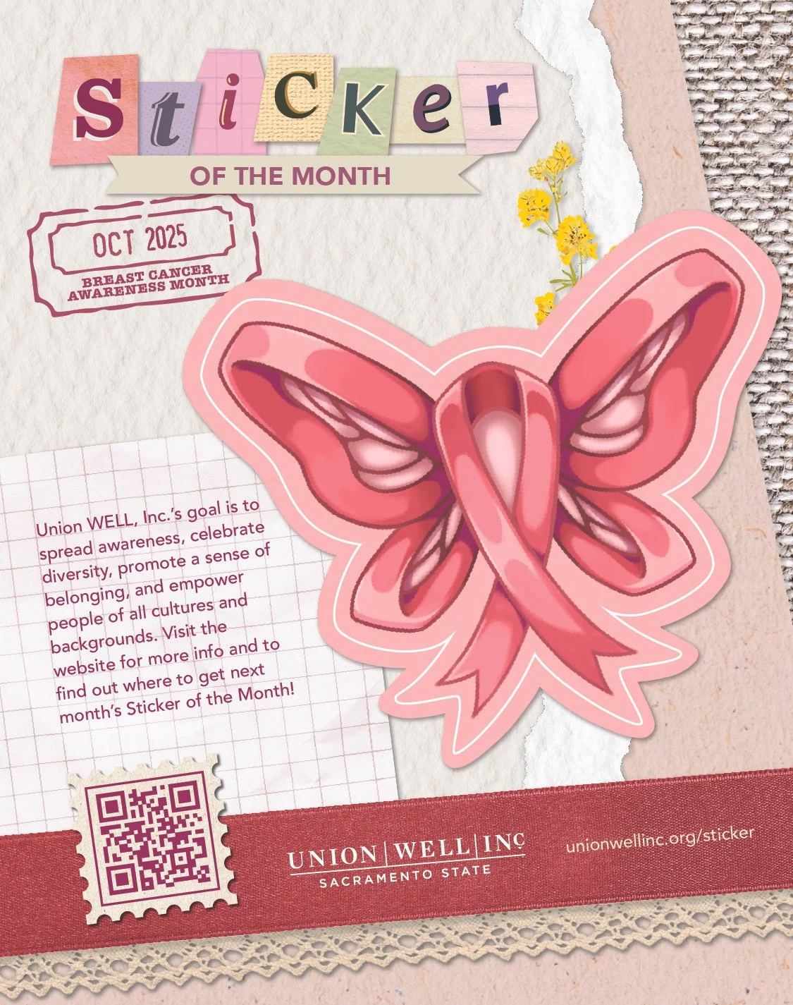
For October, the Breast Cancer Awareness ribbon becomes the body of the butterfly, fully embracing the fight against cancer.
BREAST CANCER AWARENESS MONTH
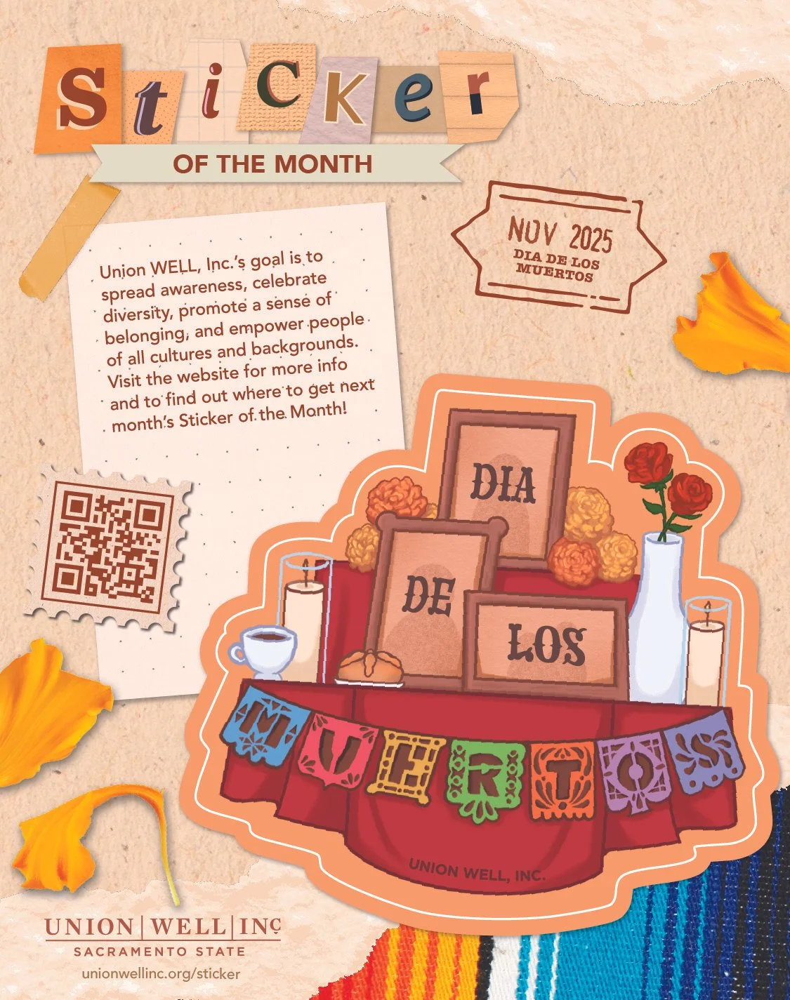
For Day of the Dead, I represented the celebration with a family ofrenda (alter) that depicts photo frames of loved ones (with a subtle silhouette), marigolds and roses, candles, and bread and coffee.
DIA DE LOS MUERTOS
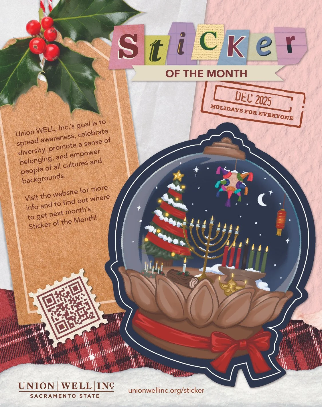
December’s sticker showcases the most celebrated holidays around the world in the winter. The snow globe represents how all cultures are part of the same globe, celebrated together and living in harmony.
HOLIDAYS FOR EVERYONE
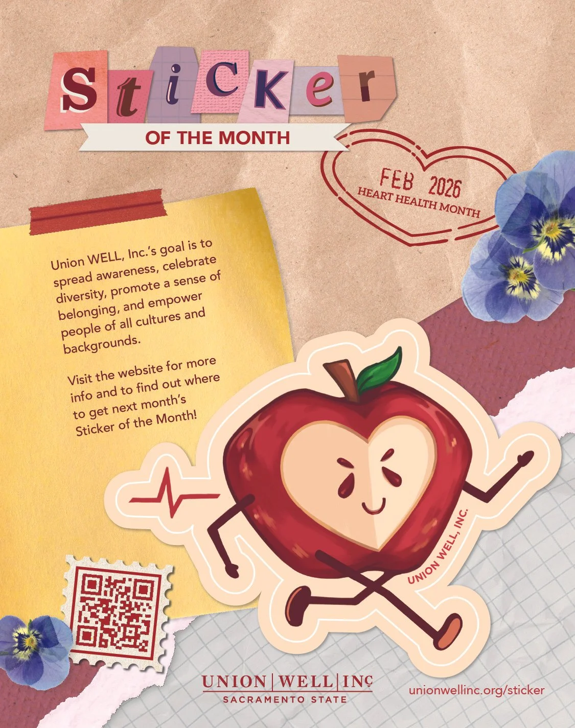
February’s sticker is a running apple with a heart cut out, revealing its happy seeds. As the saying “An apple a day keeps the doctor away” goes, the apple character represents eating foods that are good for the heart.
HEART HEALTH MONTH
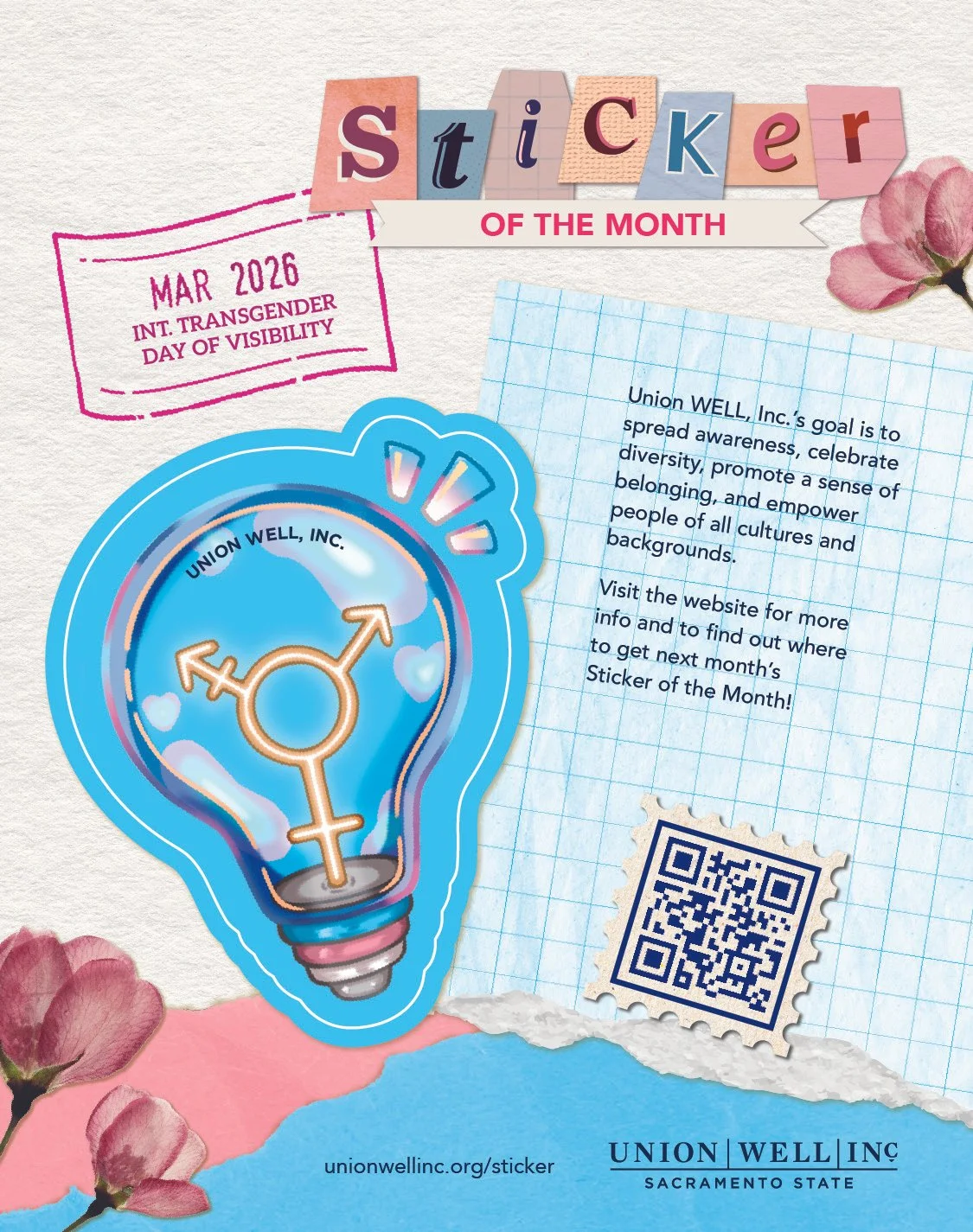
In March’s sticker, I used colors that correlate with the transgender flag’s pink, blue, and white strips. The sticker is a light bulb for “visibility,” shining a light on the community.
INT. TRANSGENDER DAY OF VISIBILITY
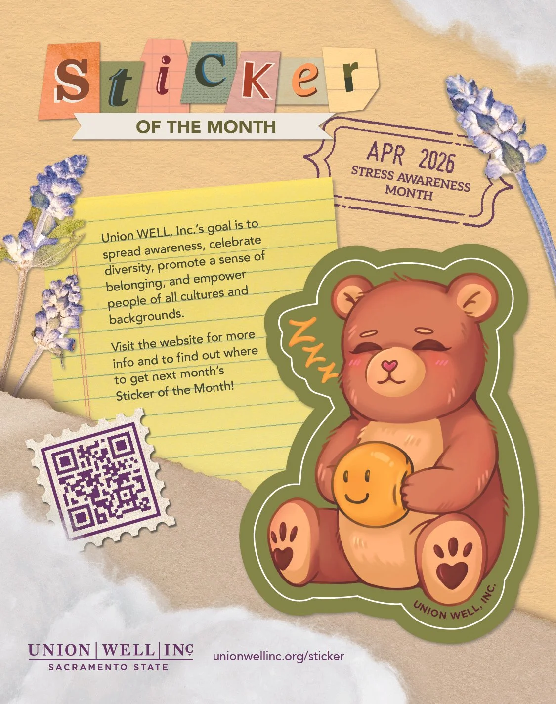
In April’s design, the teddy bear squeezing a smiley stress ball represents the transition of stress management methods and comfort from childhood to adulthood.
STRESS AWARENESS MONTH
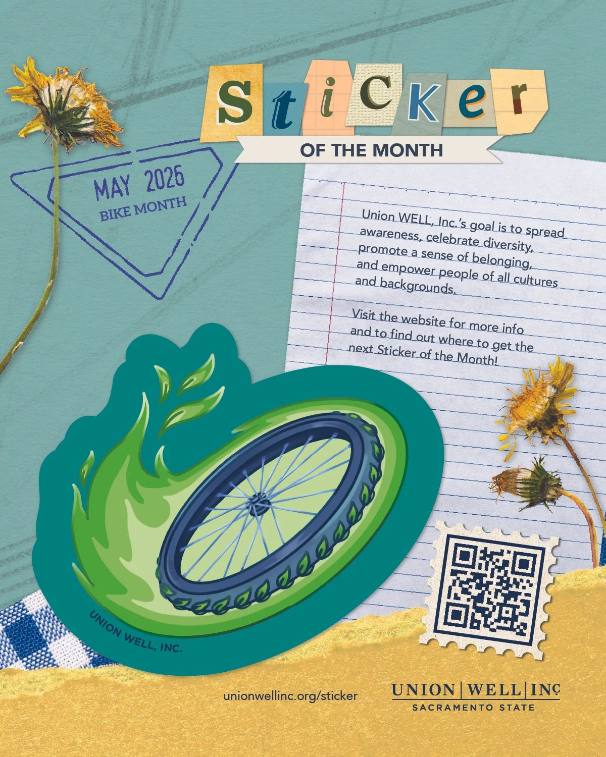
For May’s sticker, a bike wheel with vibrant, green flames and leaf-shaped tracks speeds into an upward momentum, representing of how each bike ride can make an impact and improvement for a healthier lifestyle and planet.
BIKE MONTH
DIGITAL SCREEN GRAPHICS
Every sticker theme is translated into a horizontal, digital graphic to announce and spread awareness of the most recent sticker design to students through digital screens displays. The digital aspect allows for fun animations, bringing each sticker to life. These graphics also include the locations that student will need to go to receive their stickers.